If you're curious about what a logo is and how it can transform your business, you're in the right place. Let's start with the basics.

Elevating Your Business Identity: A Logo Story

Hey there,

Ever wondered about the silent storyteller behind successful businesses? That’s right – the logo. It’s not just a design; it’s the heartbeat of your brand, the face that speaks volumes about who you are and what you stand for.

What is a LOGO?

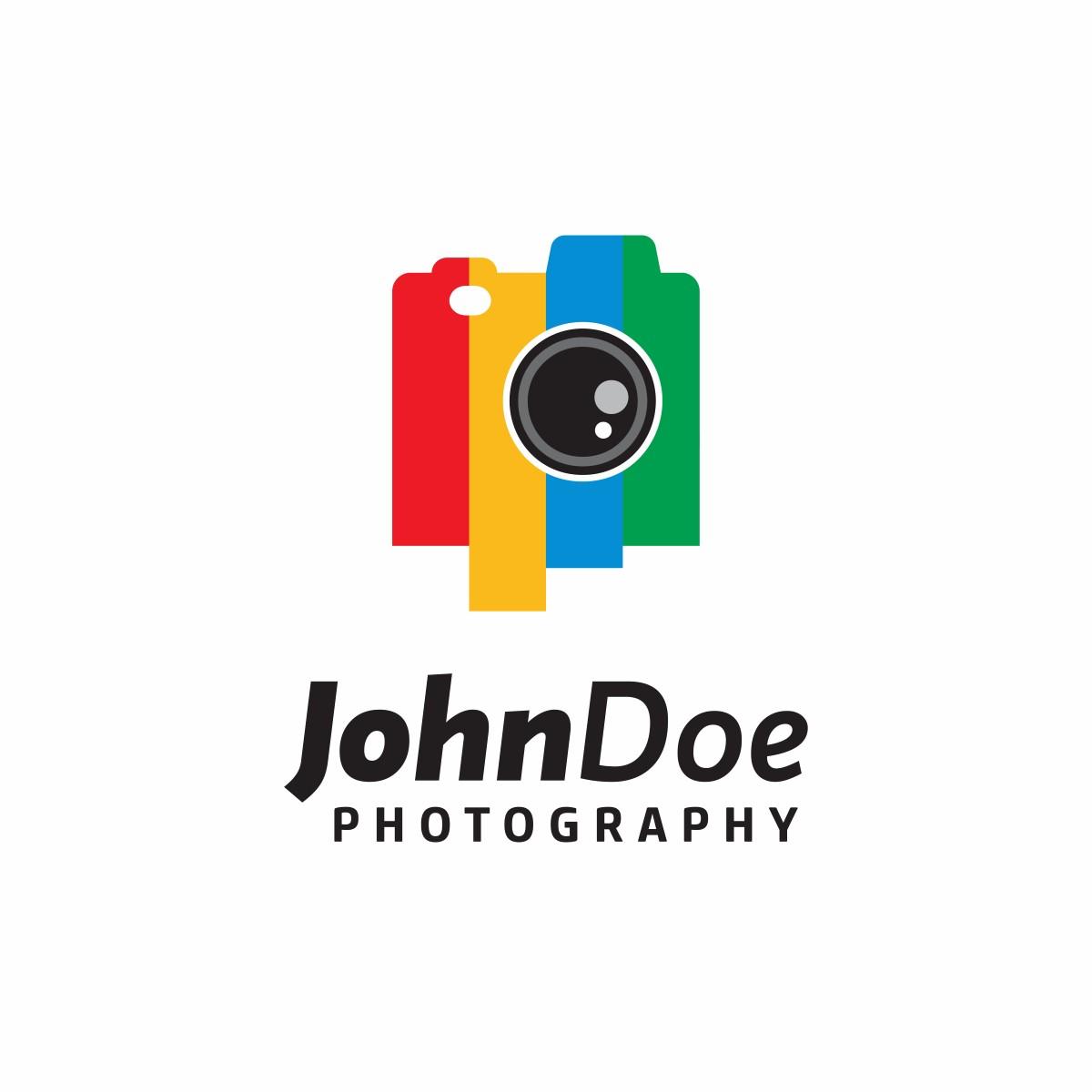
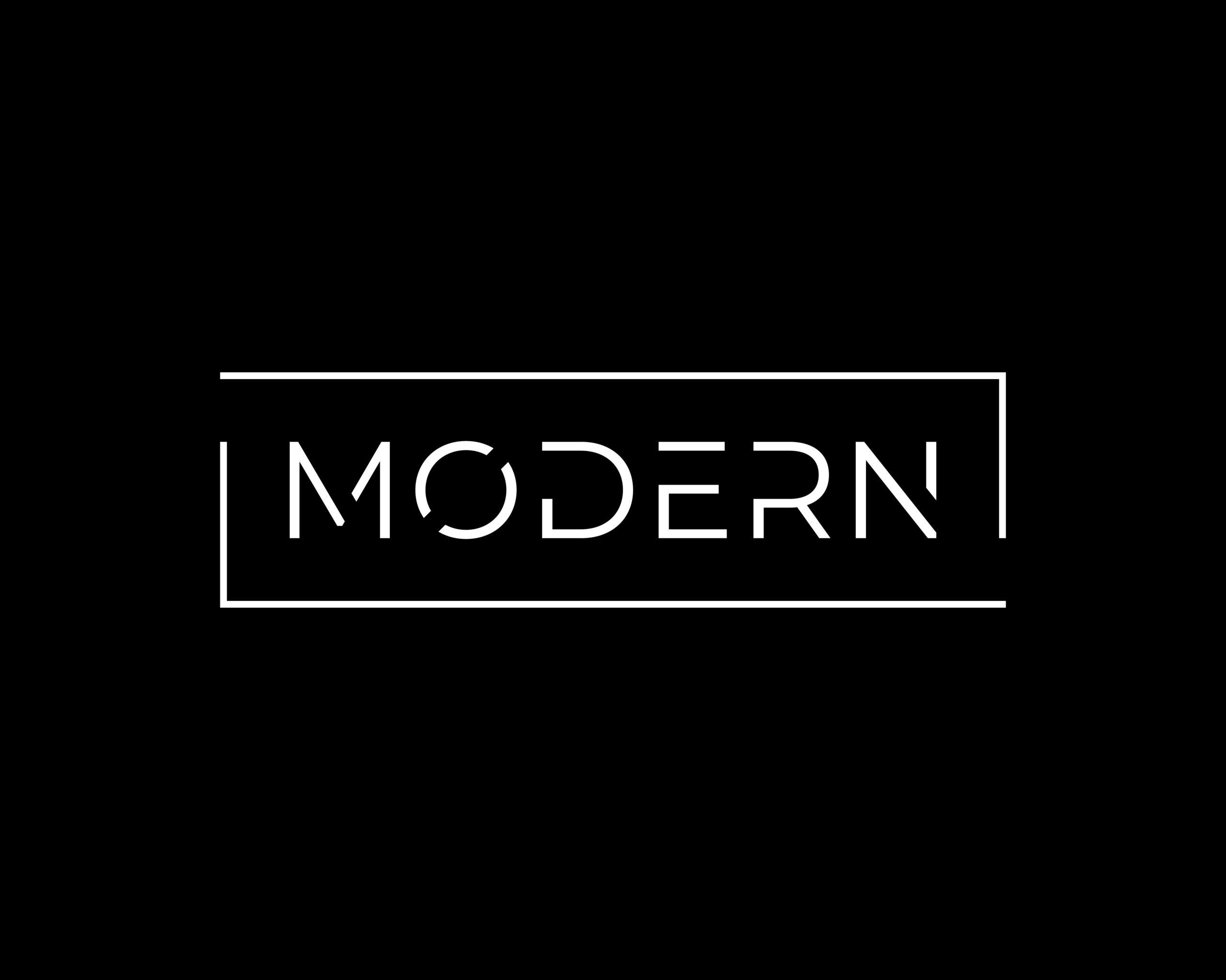
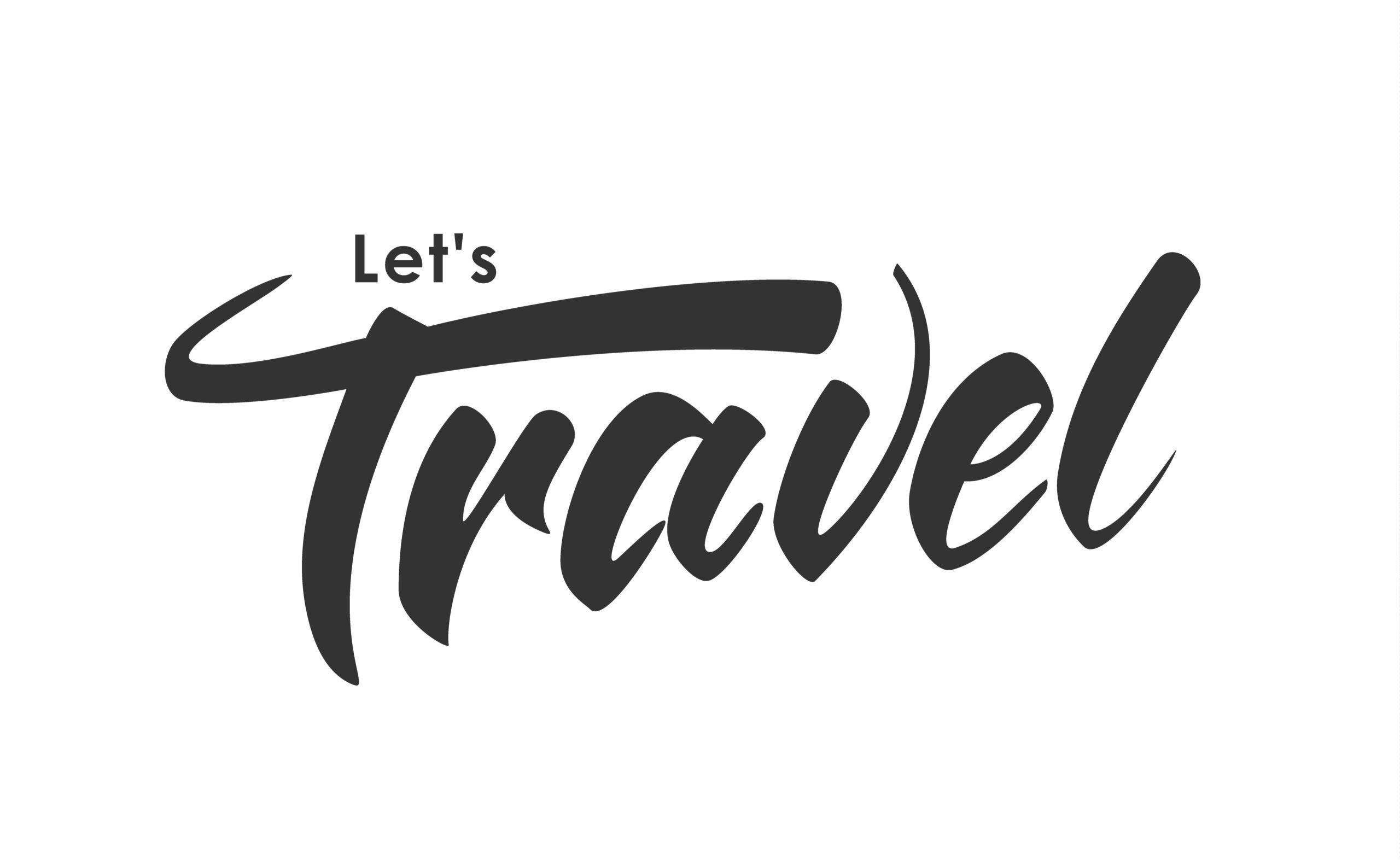
Your logo is more than ink on paper; it’s a symbol, a signature that uniquely identifies your business. Think of it as the first impression, the friendly handshake that leaves a lasting imprint on your audience.

The term “logo,” derived from the Greek words “logos” and “typos,” represents the graphic representation of a commercial symbol (emblem/symbol) for any kind of business or organization (company, foundation, project, etc.). Its purpose is to differentiate the entity it represents from others of a similar nature and make it recognizable to the public. The logo is expressed through a graphic design (visual element), which can be a symbol, a name written with a distinctive technique, or a combination of both.

As the logo is intricately tied to the corporate identity it represents, it should remain unchanged in every form of visual communication, whether print, electronic, or outdoor.

A well-designed logo should combine typographic and graphic elements in such a way that it expresses the personality of the organization on one hand and attracts the target audience on the other.

Given its association with the corporate identity of the represented business, the logo should remain consistent in every form of visual communication, whether it’s in print, electronic media, or outdoor advertising.

A well-designed logo should seamlessly integrate typographic and graphic elements to express the organization’s personality and appeal to its target audience.

Remember, the logo is a crucial part of your corporate identity or visual communication strategy. It should remain consistent across all applications, making your business easily recognizable.

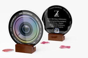
Caution: The logo does not replace the professional business card, and it’s a mistake to include too much information, such as phone numbers, etc.

What will I gain by having a logo?

In the bustling world of business, a strong logo isn’t just about looking good. It’s your trust-builder, your recognition magnet, and the secret sauce that sets you apart from the competition. It’s the key to a memorable brand identity.

A properly designed symbol:

  • Introduces you to your customers.
  • Expresses the style, values, and goals of your company.
  • Sets you apart from the competition.
  • Simultaneously attracts the target audience you address.

Elements of an Effective Logo

To truly appreciate the power of logos, one must understand the art and science behind their creation. From color psychology to typography, each element is meticulously chosen to create a logo that resonates with the audience. It’s a harmonious blend of design principles and strategic thinking, ensuring that every aspect aligns with your brand’s narrative.

How can I distinguish a proper logo?

  1. It avoids excessive details.
  2. It shouldn’t follow trends.
  3. It is not a replica of another.

What logo categories exist?

  1. Pictorial (With Symbol)

    • Logos in this category feature simple yet striking symbols. Clean lines, a primary symbol, and the company name. Often, they can function abstractly even without the business name.
  2. Wordmark

    • The name serves as both the symbol and the logo. Here, typography is adapted to create the final mark.
  3. Monogram or Digram

    • An intermediate solution between the pictorial and wordmark. Typically chosen by businesses with long or challenging names. One or two letters are transformed into the symbol of the business for brevity.
  4. Emblem

    • The business name becomes a seal. It functions as a standalone unit and is directly placed in all corporate applications.
  5. Handwritten

    • A more artistic approach, often used for projects with a personal signature or style.

Crafting Identities, Not Just Designs

This is  comprehensive logo showcase study of Zark Photography.

Welcome to the Zark Photography Logo Showcase Study. This journey delves into the creation of a sleek and modern logo for my client, Georgia, and her photography studio, Zark Photography. Discover the meticulous process behind crafting a visual identity that not only meets but exceeds expectations.

Logo Design Elements:

Our canvas is painted in a sophisticated black hue, housing a composition of capital letters “ZARK” seamlessly blended to form a stylized capital “Z.” This artistic arrangement is complemented by the word “Photography,” standing proudly alongside the symbolic Z.


Conceptualization:

Georgia’s vision was clear – a modern stamp for branding her captivating photographs. The design journey unfolded through numerous sketches and experiments, each iteration refining the interplay of the capital letters until the perfect composition emerged.

The challenge lay in achieving a modern and sleek aesthetic while preserving the distinct identity of each letter. Through iterative exploration, we found the delicate balance, turning challenges into opportunities for a unique and impactful design.


Some of my Work

en_USEN